Unicare
Conceptual Healthcare Ecosystem

Contribution
Solo Project
Team
Individual
Tools
Figma, Miro, Google Forms
Duration
6 Months
Overview
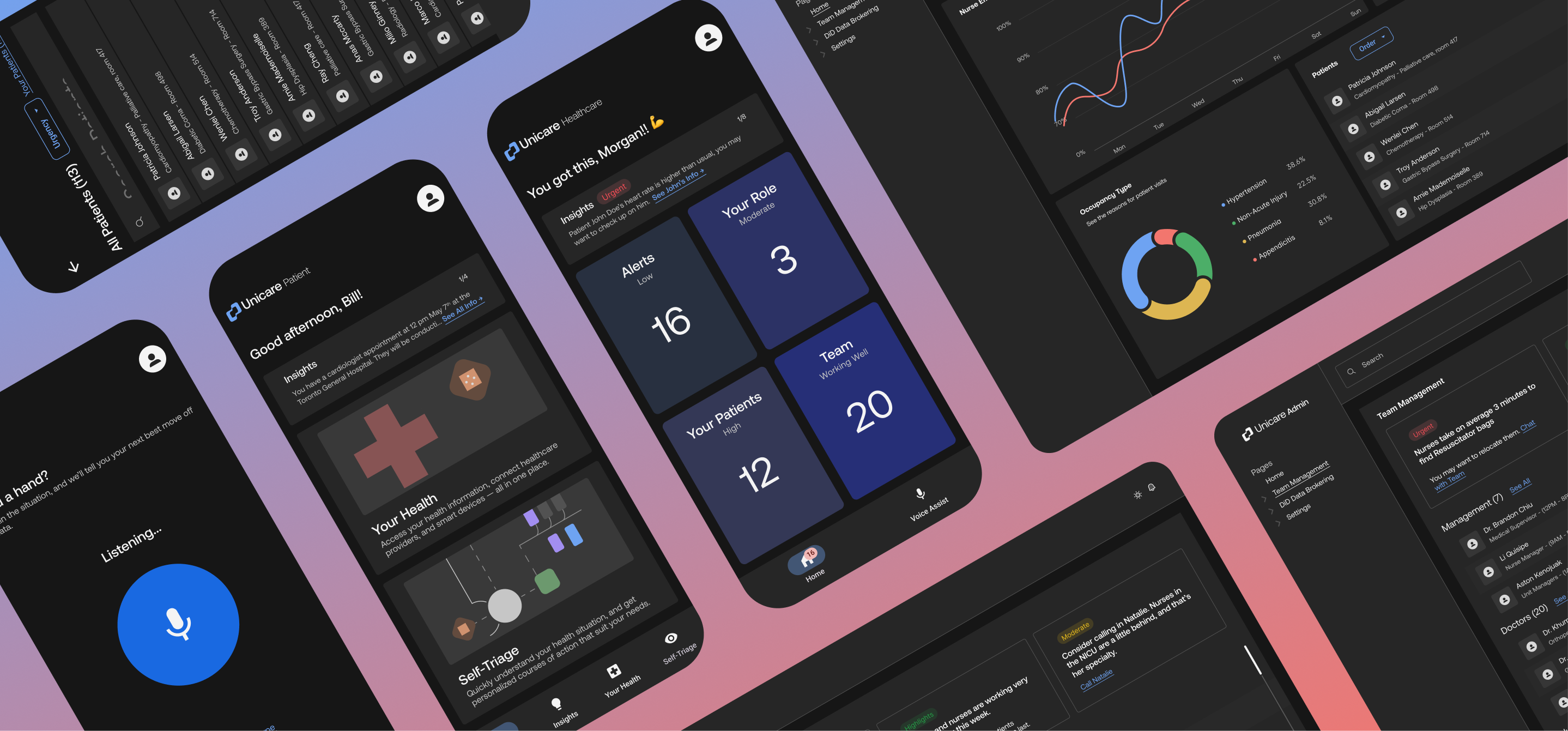
A conceptual healthcare platform designed to serve patients, healthcare workers, and hospital administrators through AI-driven insights, improved care navigation, and ethical data sharing.
This case study focuses on the solution. My thesis PDF contains my thinking and design process in-dept.
This case study focuses on the solution. My thesis PDF contains my thinking and design process in-dept.
The Problem
Canada’s healthcare system is under increasing strain:
- Overworked medical staff face burnout.
- Managers struggle with scarce resources.
- Patients endure dangerously long wait times.
This project began with a personal catalyst: my mother, an infection control nurse, retired mid-pandemic due to severe burnout. Her experience inspired me to explore how technology could reduce pressure on the system and improve care delivery.
Solution
An AI ecosystem that lowers wait times using rich medical data to help patients, doctors, nurses, and administration quick and confident decisions.
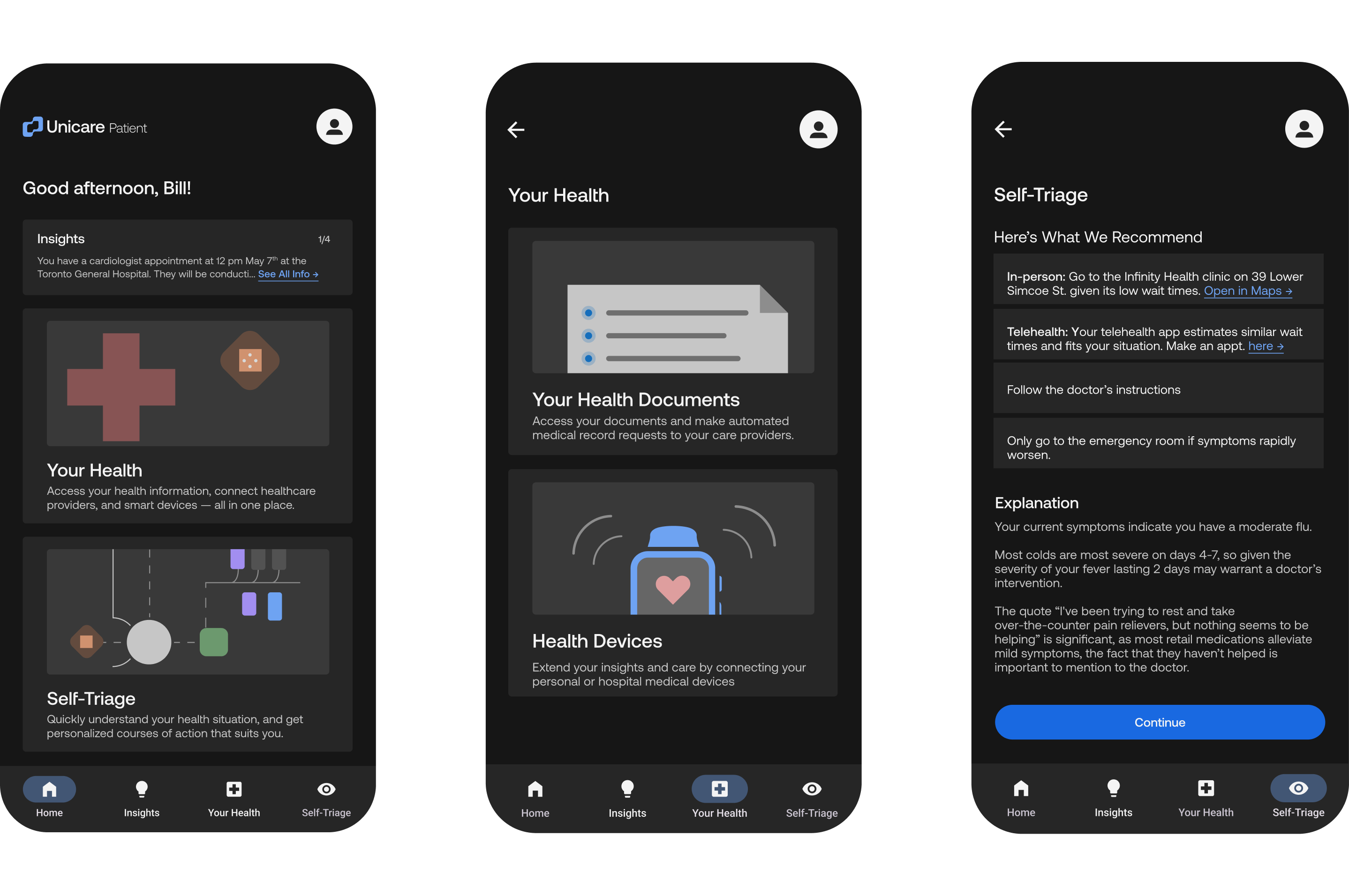
For the Public: A Patient Portal
That uses health data and research to give patients an easy and explainable action plan.

Bedside Support for Medical Staff,
Like a chess computer for priorities. Nurses, doctors, and other hospital staff gain a what to do and why using AI's ability to make complex data from medical IoT, process insights, and from shared lesson learning into something easily-digestible and actionable.

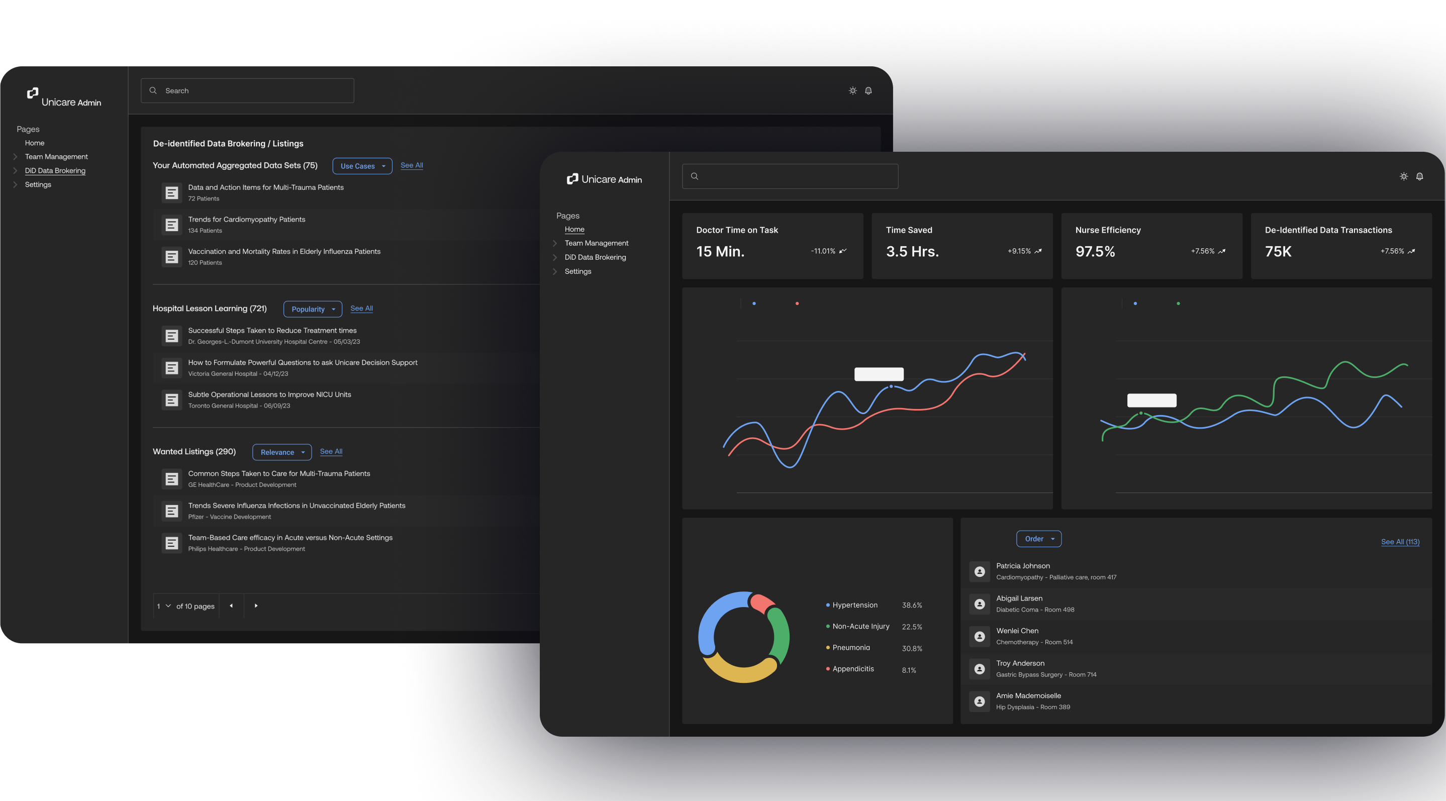
An Administrative Ontology Platform for Hospitals to Share and Monetize Insights
Powered by de-identified patient data, hospitals can freely share insights on a deeper level between each other, especially with actions taken towards success. Furthermore, this enables them to broker de-identified data to ethically generate revenue. Research organizations can benefit heavily from this rich data, and thus the medical industry as a whole.

Reflection & Takeaways
Talking to people is king 👑
I spent as much time as I could talking to people. From nurses, classmates, colleagues, to even talkative people sitting next to me on flights. Whether done formally through a qualitative forms or casually Discord calls, you can find value through doing this and asking the right questions.
Bring a magician? 🪄
After creating this case study, I discovered a type of usability testing called the "Wizard of Oz Method". It works by letting someone behind the scenes work as the system you're trying to test. This could have unlocked the opportunity for me to get more valuable feedback through creating more real experiences for users.
Validate the brand direction further 🔬
To build trust, I leaned into a sharper, more serious visual style. My thoughts for dark mode UI weren't just aesthetic; they were intentional. I wanted to help humanize interactions by preventing workers’ faces from lighting up in a way that could feel performative or distracting. Still, there’s a perceived tension between approachability and seriousness—two traits that often feel at odds but can coexist with the right balance of design choices. It's a space I’d like to keep exploring through research, testing, and iteration.
Be wary of "trends for trends sake" 🤔
Usefulness is more important than shiny ideas. During my research, I found myself exploring shiny ideas like blockchain and tokenization for health records. After speaking with users, I found that despite the tech’s potential, most average people likely wouldn’t have adopted these solutions. I learned how important it is to balance both vision with value.